THE BLOG
good vibes only
Back in March, I looked at my website, and my online presence, and felt that things were not aligning anymore. I had to be honest with myself, and my gut was telling me that I needed a more cohesive brand to reflect my work and speak more closely to my ideal clients. I had been learning a ton about branding over the past couple years at conferences i had attended, blogs I had been reading and podcasts I was listening to. I realized that a brand is SO much more than a logo and some fun colours.
As a business owner, it is a big decision to change everything that you have put out into the world! BUT, it is important to continue to grow – always.
Over the last 5 months, I have absolutely poured my heart into my business and my brand. I have worked with the most patient, talented and fabulous designer/human being to help bring my vision to life. Over the next week, I will be introducing small bits of the process, all leading up to the launch of the NEW WEBSITE! You guys, there are no words to describe my excitement!! It has been a long process, but I have learned so much along the way about myself, and my clients.
A lot of people have asked me, what the heck has been taking so long! I thought I would spend some timeS breaking down the process a bit, so if other creative entrepreneurs are considering a re-brand, you can consider what some of the process might entail. For anyone else, it might just give some perspective into the fun behind the scenes of owning your own business 🙂
1) Find a graphic designer. Where to begin here… Well, it really depends what you want here. I was looking for someone who would be able to fully design and create a new website, blog, and help me with the branding process. I wanted to connect with the person, and feel like they were invested in me as well as my business. Designers who seemed to offer a really personalized experience were being considered. I wanted that person to feel like they would be a good fit for me, and me for them. I have to be honest, this was probably the most challenging part. I spent countless hours on Pinterest looking at design boards and researching designers. I probably contact about 15 different people, but it was super easy to narrow it down once I started getting responses.
My Red Flags:
- When the e-mail was a template e-mail with my name inserted, and there was nothing speaking specifically to me and the questions I asked in the initial e mail.
- When in the first three e-mails back and forth, I couldn’t tell if the designer was a man or a woman, or had any idea what their name was. How could someone help me figure out who I am and how to show that in the best possible way on the internet, if I can’t tell anything about them other than their catchy business name after 3 e mails?
- When people asked for a deposit immediately before taking the time to answer questions.
What helped me narrow it down:
- When there was a keen, real interest felt in the e mail.
- When the designer took the time to look at your website before e mailing you back to ensure that they felt we were a good fit.
- When the designer seemed like a human being that was excited to bring a new brand to life for me!
- When designers responded to questions quickly and thoroughly. It was a good indication of their dedication.
I decided to go with Ravyn from Three Fifteen Design, and I have not regretted it for a second. I trusted her whole heartedly to take my vision and turn it into something amazing, and she has never let me down for a second. I could write an entire blog post about my experience with her. She kept me so excited throughout the whole process, and continually amazed me with every single thing she did!
2) Answer a questionnaire about your business asking all sorts of questions about who you are and what is important to you, who you enjoy working with, etc….
3) Gather inspiration. Find inspiration from favourite websites, Pinterest, magazines, and anywhere really. One of my favourite sites was a random food website! Ha! I made a vision board on Pinterest that you can see here:
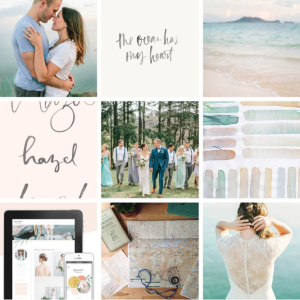
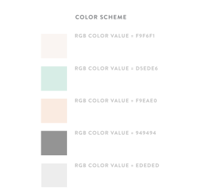
4) From my design board, Ravyn created a smaller inspiration inspiration board incorporating hand lettering, a soft colour palette and some of my favourite images. Once I loved everything on that board, that was what we looked to for further inspiration.
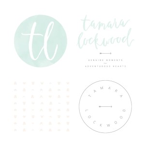
5) Time to design a logo and alternate logos to use in my physical branding. This was actually one of the hardest parts of the entire process! I wanted a logo that incorporated hand lettering, and I couldn’t have been happier with the result!

6) Once the logo and alternate logos were made, we went on to design the website. With this came another questionnaire asking for specific website inspiration. I spent a ton of time looking online at websites (not just how they looked), but their navigation, their fonts, their flow etc. These were the things I started paying much closer attention to. I sent back the longest, most detailed answers ever.
7) Ravyn somehow took alllllllllll of the inspiration I provided and sent back screenshots of a new homepage, About Page and Gallery Page. Until this point, I had no idea what exactly I wanted this to look like, until I saw what she created. She took everything I had said and wrote over the past few months and it was perfect.
8) At this time, stationary proofs were made and approved… I really love all stationary everything, so I loved this part 🙂
The business cards…..
9) Once the website was finalized (choosing images may or may not have been the most challenging part), the blog was created.
10) Pricing Guides and Welcome Packages were finalized
11) Ravyn guided me with steps to introduce the new brand through social media.
12) NEW WEBSITE RELEASED!!!! 🙂 WOO! And here it is 🙂 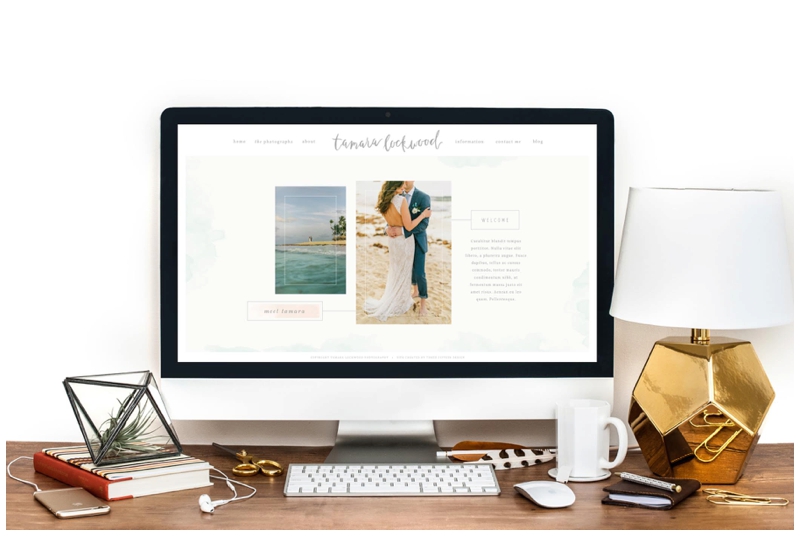
My philosophy:
My photography isn’t about a simple click. It’s about feeling comfortable and at ease, while I strive to capture your unique story honestly, with natural & beautiful images. Beyond that I approach each and every wedding with endless energy, enthusiasm and love. I promise, we will have a blast.
Beyond beautiful images, I want to know who you are, and what matters most to you. The result will be tangible, meaningful images that reflect the real you…. the hearts behind the love.
On your wedding day, I look for moments. Those moments that you know are happening, and those you might miss. My purpose is to capture genuine images to bring you back to a moment otherwise gone. I believe in capturing emotion, and laughing a lot along the way.
I believe in exploring and always looking for new adventure, dreaming big and loving bigger.
These moments all create YOUR authentic story. I can’t wait to meet you!!